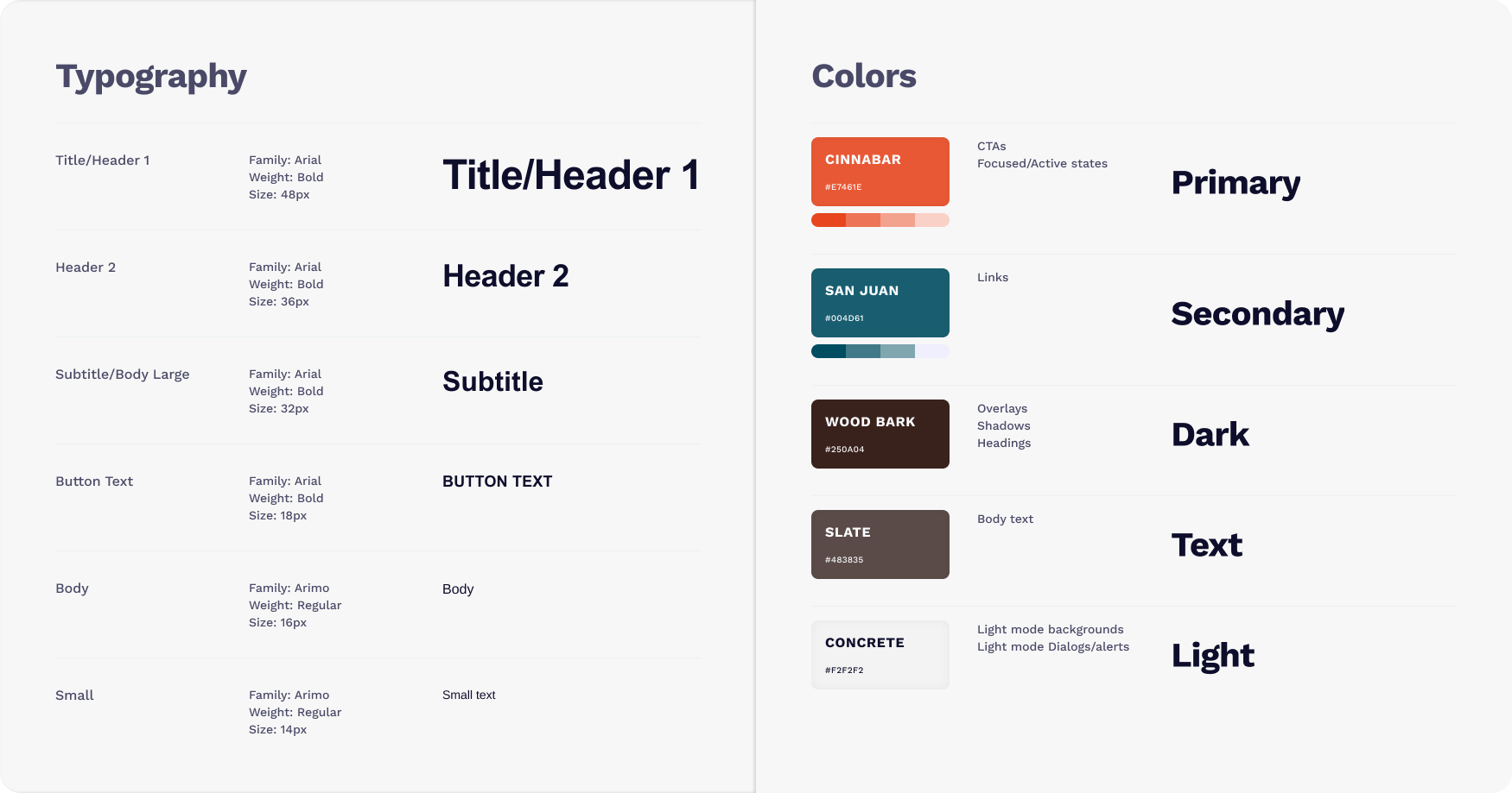
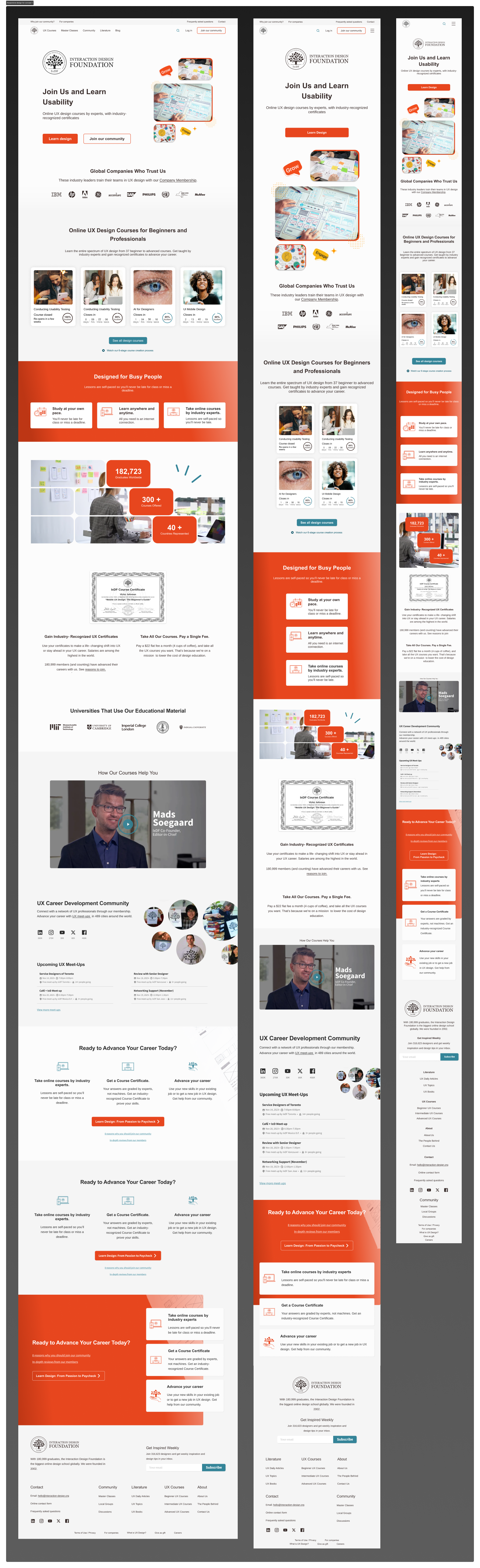
The color scheme used a white and neutral base to create a clean and professional look, while an orange accent color was applied to CTAs and important sections to draw attention.
Improved navigation with clear menu options and intuitive scrolling guided users through the page. Key elements like certifications, testimonials, and CTAs were prominently displayed to maintain a clear visual hierarchy.
In one scenario, users navigated to find information about certifications. Feedback highlighted that certifications were easy to locate, but the text could be more descriptive. We enhanced descriptions to clarify certification benefits. Another scenario involved users attempting to sign up after browsing the landing page. While the sign-up CTA was effective, feedback suggested adding more testimonials for reassurance, which led to the inclusion of a “Success Stories” section.
Users appreciated the professional look, responsive design, and clear CTAs. Areas for improvement included adding more interactive elements, such as videos or animations.
The redesign resulted in a significant potential increase in signups. User feedback surveys indicated a 90% satisfaction rate with the new design.
Simplified navigation and compelling visuals improved the overall user experience, aligning with user expectations. Highlighting industry recognition through trusted global company logos built trust and credibility.
Early usability tests provided valuable insights that shaped the final design. Showcasing industry trust through logos and testimonials had a significant impact and balancing content and simplicity ensured all key information was included without overwhelming the user.